When it comes to ranking your app high on the Apple App Store, your app’s ratings and reviews and App Store Optimization (ASO) do the heavy lifting.
However, once users are on your app listing, a few other elements come into play – one of them being app screenshots. Alongside app preview videos, it’s screenshots that help users decide whether to download your app or not.
Studies reveal that, on average, an App Store visitor only spends 10 seconds on an app’s product page and is likely to read only 10% of the content.
This makes screenshots all the more important, as they’re the first thing your target audience sees.
In this guide, we’ll walk you through Apple’s App Store screenshot guidelines and provide you with tips and tricks for creating screenshots that encourage users to hit that Get button.
Let’s get started. 👇
App Store screenshot guidelines
Apple’s guidelines regarding screenshots are pretty straightforward. The first rule is that you should always use screenshots directly from your app. This is to ensure that your screenshots accurately depict your app’s features and functionalities.
Additionally, Apple allows you to upload a minimum of one and a maximum of ten screenshots for your app. It’s highly recommended to use all ten, as it provides you with enough room to showcase your app’s unique selling propositions (USPs).
Lastly, it’s crucial to stick to Apple’s technical specifications, including dimensions and resolutions, which we’ll delve into now. 👇
App Store screenshot dimensions and resolutions
Apple has made it very easy to upload your screenshots. For instance, if your app’s user interface (UI) is the same across multiple device types and sizes, you can simply provide the highest resolution screenshots on the App Store Connect. They'll automatically cascade down to smaller device sizes.
However, if you don’t want to use scaled versions, then you’ll have to do it using Media Manager. In that case, if your screenshots don’t adhere to the App Store’s dimensions and resolutions, then they may be rejected during the app review process.
Apple has provided screenshot sizes for each display size and supported device; deviating from these can result in your app listing being delayed.
iPhone screenshot sizes
The table below shows the screenshot sizes required for different iPhone sizes.
Display size | Supported devices | Screenshot sizes |
6.7” Display | iPhone 15 Pro Max iPhone 15 Plus iPhone 14 Pro Max | Portrait 1290 x 2796 pixels Landscape 2796 x 1290 pixels |
6.5" Display | iPhone 14 Plus iPhone 13 Pro Max iPhone 12 Pro Max iPhone 11 Pro Max iPhone 11 iPhone XS Max iPhone XR | Portrait 1284 x 2778 pixels 1242 x 2688 pixels Landscape 2778 x 1284 pixels 2688 x 1242 pixels |
6.1" Display | iPhone 15 Pro iPhone 15 iPhone 14 Pro | Portrait 1179 x 2556 pixels Landscape 2556 x 1179 pixels |
5.8" Display | iPhone 14 iPhone 13 Pro iPhone 13 iPhone 13 mini iPhone 12 Pro iPhone 12 iPhone 12 mini iPhone 11 Pro iPhone XS iPhone X | Portrait 1170 x 2532 pixels 1125 x 2436 pixels 1080 x 2340 pixels Landscape 2532 x 1170 pixels 2436 x 1125 pixels 2340 x 1080 pixels |
5.5" Display | iPhone 8 Plus iPhone 7 Plus iPhone 6s Plus | Portrait 1242 x 2208 pixels Landscape 2208 x 1242 pixels |
4.7" Display | iPhone SE (3rd and 2nd generation) iPhone 8 iPhone 7 iPhone 6s iPhone 6 | Portrait 750 x 1334 pixels Landscape 1334 x 750 pixels |
iPad screenshot sizes
The table below shows the screenshot sizes required for different iPad sizes.
Display size | Supported devices | Screenshot sizes |
12.9” Display | iPad Pro (6th, 5th, 4th and 3rd generation) | Portrait 2048 x 2732 pixels Landscape 2732 x 2048 pixels |
12.9" Display | iPad Pro (2nd generation) | Portrait 2048 x 2732 pixels Landscape 2732 x 2048 pixels |
11" Display | iPad Pro (4th and 3rd generation) iPad (10th generation) iPad Air (5th and 4th generation) iPad mini (6th generation) | Portrait 1488 x 2266 pixels 1668 x 2388 pixels 1640 x 2360 pixels Landscape 2266 x 1488 pixels 2388 x 1668 pixels 2360 x 1640 pixels |
10.5" Display | iPad (9th, 8th and 7th generation) iPad Pro iPad Air | Portrait 1668 x 2224 pixels Landscape 2224 x 1668 pixels |
9.7" Display | iPad iPad mini | Portrait (without status bar) 1536 x 2008 pixels 768 x 1004 pixels Portrait (with status bar) 1536 x 2048 pixels 768 x 1024 pixels Landscape (without status bar) 2048 x 1496 pixels 1024 x 748 pixels Landscape (with status bar) 2048 x 1536 pixels 1024 x 768 pixels |
Apple Watch screenshot sizes
The table below shows the screenshot sizes required for different Apple Watches.
Devices | Screenshot sizes |
Ultra 2, Ultra | 410 x 502 pixels |
Series 9, Series 8, Series 7 | 396 x 484 pixels |
Series 6, Series 5, Series 4 and SE | 368 x 448 pixels |
Series 3 | 312 x 390 pixels |
Apple TV screenshot sizes
The table below shows the screenshot sizes required for Apple TV.
Devices | Screenshot sizes |
Apple TV | 1920 x 1080 pixels 3840 x 2160 pixels |
Mac screenshot sizes
The table below shows the screenshot sizes required for Mac.
Devices | Screenshot sizes |
Mac | 1280 x 800 pixels 1440 x 900 pixels 2560 x 1600 pixels 2880 x 1800 pixels |
Apple Vision Pro screenshot sizes
The table below shows the screenshot sizes required for Apple Vision Pro.
Devices | Screenshot sizes |
Apple Vision Pro | 3840 X 2160 |

App Store aspect ratio and layout requirements
While creating screenshots for the App Store, you may face the dilemma of whether to create portrait or landscape screenshots.
The rule of thumb says it’s always better to stick to portrait orientation. This is because portrait screenshots are much easier to scan and a user can see two screenshots at a time.
However, if your app is going to be used in landscape orientation, like in gaming apps, then it’s better to create horizontal screenshots. The idea is to showcase your app's UI through your screenshots.
Regarding the aspect ratio, all the screenshots you submit to the Apple App Store must adhere strictly to a 16:9 aspect ratio for iPhones and 4:3 for iPads. This aspect ratio guarantees the proper and optimal display of your screenshots on a diverse range of devices and screen sizes.
App Store Screenshot colours and backgrounds

When it comes to choosing the right colours and backgrounds for your App Store screenshots, it’ll mostly come down to your app design.
But it’s important to understand that the colours you use in your app screenshots define the moods and behaviours of your target users. For instance, if you have a finance app, then keep it minimalistic and use a white background. Whereas for a food ordering app, you can be more adventurous.
No matter what your app is, here are some guidelines that’ll help you create visually appealing screenshots 👇
Use high-quality images
Make sure your screenshots are high quality and pixel perfect. Use only high-resolution images that showcase your app's features and user interface in the best possible light.
Choose contrasting colours
Pick colours that contrast well with each other to make your screenshots stand out. Avoid using too many similar colours, as this can create a cluttered and confusing look.
Use a consistent colour scheme
Maintain a consistent colour scheme throughout your screenshots to create a cohesive and professional look. This will make your users recognise your app and easily associate it with your brand.
Avoid using too much text
When it comes to text, less is more. Don’t overload your screenshots with words, as too much text makes screenshots look cluttered. Instead, use concise captions to highlight key features that users can process at a glance.
Use a clean and simple background
Avoid using busy backgrounds. A simple background helps to draw attention to your app's content and makes it easier for users to focus on the features.
Test your screenshots on a different device
Don’t forget to test your screenshots on different devices and orientations to ensure they look great on all screen sizes and resolutions.
Want to start your app project with us?
Book a demoSpeak with one of our product experts today.
By proceeding you agree to Builder.ai’s privacy policy and terms and conditions

Styles of App Store screenshots
Now there are many ways you can design your screenshots. Let’s take a look at some of the commonly used styles 👇
1 - Feature showcase

Image source: English Grammar Basics Lite
In this style, your screenshots will showcase the specific features and functionalities of your app.
However, your users can find this style of screenshots a bit less engaging as they don’t communicate your messaging across and they have to guess what you're trying to show.
Use feature showcase screenshots as placeholders so you can get your app listing live as soon as possible. Then, you can update your listing with more sophisticated screenshots.
Pros
- Easy to create
- Shows all the features
Cons
- Less engaging
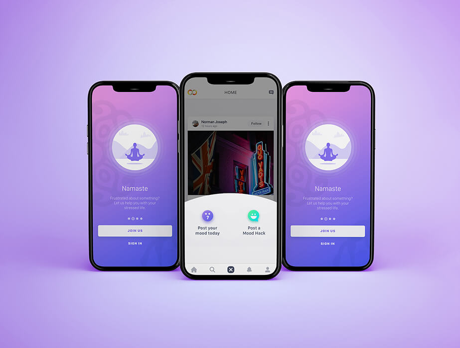
2 - Lifestyle screenshots

Image source: 30 Day Fitness - Home Workout app
In this style, your screenshots depict real-life situations where your app might be used.
For instance, if you have a fitness app, then you can show people exercising or track their progress.
This way, your users can visualise how your app solves their problems and how it'll fit into their lives.
Pros
- Demonstrates use cases
- Enhanced engagement
Cons
- Can be challenging to create
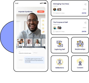
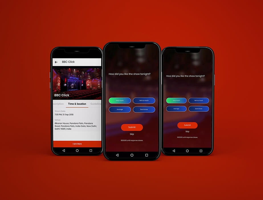
3 - Connected

Image source: Sensibull for Options Trading
In this widely popular style, you use multiple screenshots in a sequence to show a journey.
If done correctly, this is very eye-catching. If not, they can be very complex, leaving your users confused. This is why you need careful planning and good designers to get it right.
Pros
- Easier to showcase a workflow
- Visually appealing
Cons
- Requires careful planning
- Can be confusing
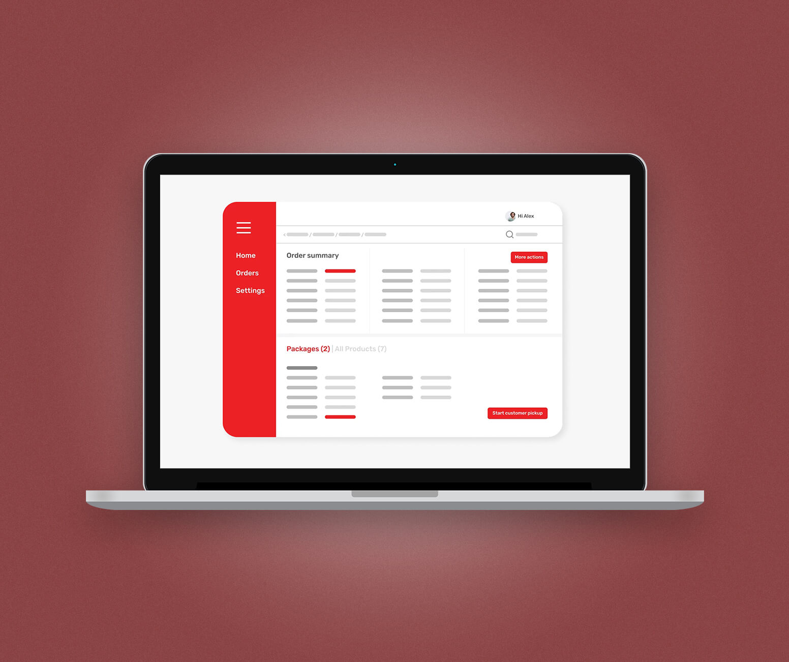
4 - Background and device

Image source: LinkedIn
This style is similar to the feature showcase style but with a solid colour or a blurred background behind the device frame.
This style is used to overcome the downsides of the more basic feature screenshot. This way, you can add a touch of colour or a sense of depth to your screenshots while maintaining a clean look.
By using the background and device style, you create consistent and aesthetic screenshots.
Pros
- Easy to create
- Focus on app features and functionalities
Cons
- Not very engaging
5 - Hybrid

Image source: Fitness
In this style, you can combine design elements from multiple styles of screenshots. For instance, for a fitness app, you can use a solid colour background and device in front but use lifestyle images of people using your app.
Ultimately, the idea of creating hybrid screenshots is to create as engaging screenshots as you possibly can.
Pros
- Flexibility to incorporate any element
- Highly engaging
Cons
- Very complex to design
- Can show inconsistencies in the design
App Store screenshot examples
OpiGo

OpiGo is India’s new-age social platform where users can experience a gamified way of sharing stock ideas with friends.
In the app, you can make stock buddies, interact with experts and learn to invest in the right way.
Lesser
Lesser is Saudi Arabia’s first recycling app. The platform doesn’t just make it easy for individuals to play their part in a zero-waste future; it also creates an incentive for them to recycle through a gamified reward scheme.
YLanes

YLanes is a conversation app where you can be your true self and connect with those who ‘get you’. The platform serves as a safe, non-judgemental space, designed to enable meaningful conversations.
My Hooxy

My Hooxy is a smart oximeter solution that helps you take care of your wellbeing.
Using the app, you can measure your oxygen saturation and heart rate easily in real time. Also, the app helps you control and improve your abdominal breathing.
App Store screenshot best practices and tips
If you’re looking to make perfect screenshots and enhance your ASO efforts, then follow these best practices 👇
1 - Show your USP in the first 2 screenshots
Whether it’s an innovative feature or an exceptional user experience, make sure you start strong by communicating your USP in the first two screenshots. This is because the first two screenshots are always visible to users.
This is why you need to think ahead of time to make sure they’re effective in getting your message across.
2 - Provide context for your screenshots
Your potential users should be able to understand what they're looking at in your screenshots. You can do this by providing context for your screenshots by including relevant text and images.
For example, imagine you're showing a screenshot of your app's home screen. Instead of leaving users guessing, include text that explains what they’re seeing. This way, your users know what to expect from your app.
3 - Use only 4-7 words of text per screen
Yes, it’s important to provide context for your screenshots. However, lengthy text in screenshots is the easiest way to clutter your screenshots and overwhelm your users.
The shorter the text, the more appealing your screenshots become.
In any case, don’t use more than 10 words per screenshot.
Instead, use small and punchy one-liners to highlight your USP. For instance, the YLanes app uses “Connect with those who ‘Get You’,” to highlight its USP.
4 - Make them fun
Add personality to your screenshots to make them fun and attractive. You can do this by throwing in some vibrant colours and playful graphics.
Making your screenshots look unique and fun is inviting to users, which gives your app one more reason to be downloaded.
5 - Tell a story
Use your screenshots to narrate a story. You can do this by creating a flow that progresses logically from one screenshot to the next.
This illustrates the journey users will experience in your app and, at the same time, demonstrates the value of your app along the way.
6 - Checkout your competition
The easiest way to create great screenshots is by analysing what your competition is doing. Check out the screenshots of your competition to identify what works and what doesn’t in terms of design and messaging.
Use this information to make your own screenshots and find ways to make your app stand out from the competition.
Conclusion
Creating screenshots for the Apple App Store isn’t a complicated process.
However, if you want to create compelling screenshots that increase your conversion rates, you need to plan them ahead of time.
Builder.ai helps you do this. When you build your app with us, our designer works with you to create your screenshots, calling out key messages and ensuring that they’re consistent with your brand.
Hit the banner below and create your app today 👇
Want to start your app project with us?
Book a demoSpeak with one of our product experts today.
By proceeding you agree to Builder.ai’s privacy policy and terms and conditions
Laura McAllister is a seasoned Productologist at Builder.ai, specializing as a Product Owner. Her expertise lies in spearheading the successful launch of multiple apps and websites for growing businesses and startups. With a keen eye for detail and a knack for translating client visions into reality, Laura consistently delivers innovative solutions that drive tangible results.
Table of contents
App Store screenshot guidelines
App Store screenshot dimensions and resolutions
App Store aspect ratio and layout requirements
App Store Screenshot colours and backgrounds
Styles of App Store screenshots
1 - Feature showcase
2 - Lifestyle screenshots
3 - Connected
4 - Background and device
5 - Hybrid
App Store screenshot examples
App Store screenshot best practices and tips
Conclusion


 Facebook
 X
X LinkedIn
 YouTube
 Instagram
 RSS
RSS