At Builder, we're passionate about building customer experiences that matter--in a scalable way. To that effect, we love when Builder Studio Customer Product Experts contribute and today they're bringing expert knowledge constantly improved alongside our knowledgeable global Capacity Partner network. Today, we bring together our CPEs' ideas heard over and over. Want to design your next best app? Consider these rules when creating your own app for the App Store!
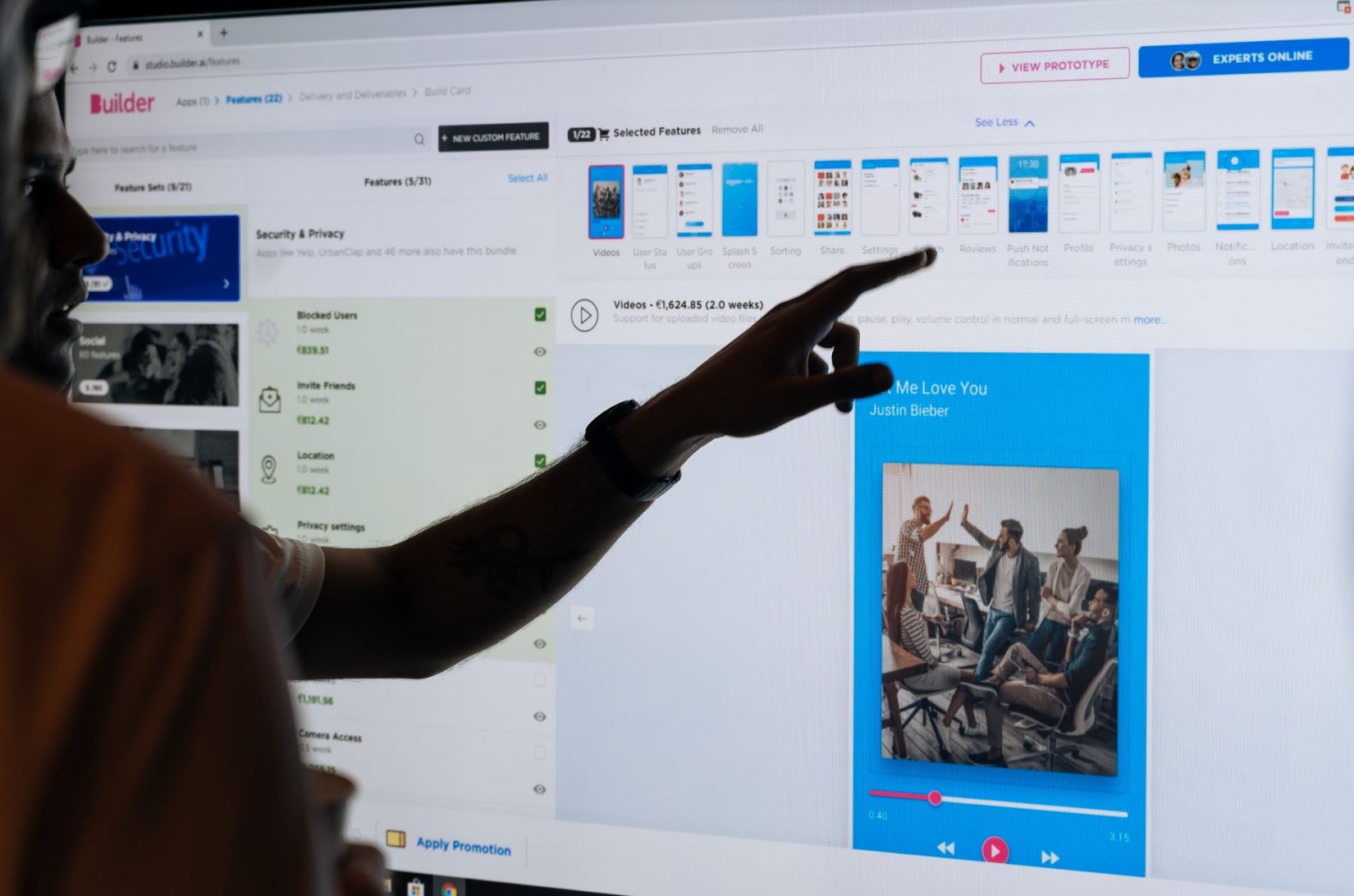
Designing an app can be overwhelming, both from the concept end and the execution side. If you're in the early development stage on your app building process, you may be getting bogged down with design elements. Good news is, Builders, we've worked on hundreds of apps. That's given us clarity on how to approach design on these projects from day one.
Below are four actionable design tips you can use to get your app design off to the right start from the beginning whether with Builder Studio or another app builder otherwise. By employing these best practices for building apps, you'll ensure your app does what it needs to engages your ideal customer and keeps them wanting what you offer.
Rule #1: Focus your design on one goal
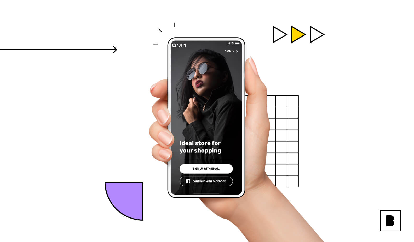
Your app has a purpose, a core idea. Your design(er) needs to center on that. Sounds easy, yes? Not so much. Start by running a SWOT (Strength, Weakness, Opportunity and Threat) analysis of your app idea just as you would for your business, so that you know where your strengths lie and what your app can offer the marketplace (it's all about your user [customer]). Identify your apps' Unique Selling Proposition, then use this to begin considering design elements and essential features. Take the Netflix app, as an example. Netflix's USP is offering instant digital access to curated TV and movie content. The entry point to the app, therefore, is profile selection. This means Netflix is all about curated content. The design focus should determine your apps' objectives which influence your design goals.
Rule #2: Always consider your user (customer)
Before you begin the app making process, draft a profile of your ideal user. Who is she, and what are her expectations for a positive user experience? Dial in on this with specificity. You can even compile a mood board of images defining who your user is. Take the information you glean from this to inform your design choices. Is your user a heavy social media user? Do you need a social media-based mobile application that emphasizes sharing and community like Cookpad? Is she a pragmatist looking for quick access to good deals like she might find via Club Factory? Knowing who your actual users are gives you a direct line to a design framework for your app.
Rule #3: Do your homework to find the best colors
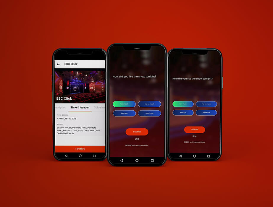
There is a shared language of color in our culture, and your end user expects consistency when it comes to certain shades. Green means go. Red means stop. Don’t confuse these expectations. Addendum to this: If your user initiates an action, make sure they can see that the action has been initiated. You never want the user thinking that taking an action has resulted in nothing. Explore the collection of apps on Builder Studio to get to know the shared language that defines app design.
Rule #4: Embrace the white space
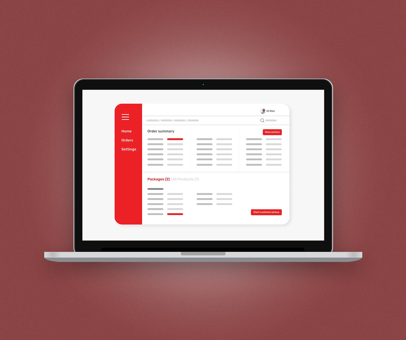
In mobile app design, clutter never works. This is graphic design 101, but you would be surprised how many forget this. You don't need to inundate the user with information or features. Negative space (aka white space) lets the user's mind work and absorb. And negative space doesn't mean bad. Putting too much in front of the eye leads to distraction and eventually disengagement. Using negative space also just makes it look better. Use negative space to give the mind room to focus on what matters your actual feature set and, ultimately, your USP.
Designing an app can be straightforward with the right tips and tools. Start exploring Builder Studio today to see how user-friendly app design and development can be. And chime in with your own design best practices across the social space on Facebook, Instagram, LinkedIn, and Twitter.
Stories published by the editorial team at Builder.ai.


 Facebook
 X
X LinkedIn
 YouTube
 Instagram
 RSS
RSS