So, you’ve launched your app and want to maximise user engagement? There’s no better way than to start it by connecting with users who trust your app and already have it. This is where in-app messaging comes in. In-app messaging can boost engagement by up to 131% for users who receive these messages compared to those who don’t.
In-app messaging features may also motivate potential buyers to move further in their customer journey by capturing their interest with precision.
In this blog, we’ll talk about in-app messaging, its benefits and the forms it takes. Also, you’ll learn how to design effective in-app messaging to drive a 75% impression rate, which is 45 times higher than email and nearly 3 times higher than push notifications.
Let’s dive in.
What is in-app messaging?
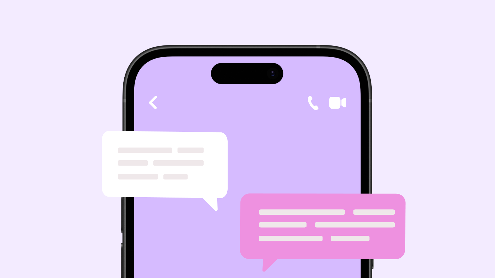
In-app messaging is a feature that enables apps to send real-time messages. It's in the form of a notification, direct message or an in-app banner presented to users while they are actively using the application. In-app messages aim to enhance user engagement and improve the overall app experience.
Benefits of in-app messaging
In-app messaging works to grab users' attention immediately. It boosts user interaction because it tailors messages based on user behaviour. Let’s take a look at the ways in-app messaging improves engagement metrics. 👇
Improved user engagement
According to Braze, in-app messages boast an impressive interaction rate of 40%, making it one of the most effective channels for user engagement. This is because real-time messaging helps in capturing user attention immediately. This not only boosts user activity but also makes them spend more time in the application.
Increased retention rates
In-app messaging has improved retention rates by almost 30%. It helps to keep users informed about the latest updates, features and promotions. This also makes users feel connected and loyal, encouraging them to use the app more.
Enhanced user experience
In-app messaging works to enhance the user experience by providing timely, relevant information and guidance right when users need it. This contextual communication makes users feel more connected. For instance, enabling real-time communication with support teams, providing personalised updates and notifications, makes the user feel more valued.
Real-time communication
In-app messaging and chat support improves real-time communication experience by enabling instant, two-way conversations within the app. This allows users to engage in immediate discussions and stay connected without ever leaving the app.
Types of in-app messages
There are different types of in-app messaging. Let’s look at them briefly here. 👇
1 - Chat messages
Chat messages are real-time messages between users or support teams. They're typically used for customer support, user interactions and community engagement.
For example, a chat message can look like: "Hi there! How can I assist you today?"
2 - Full-screen messages
Full-screen messages take over the entire screen to deliver important information or announcements. They're often used for onboarding, feature updates or critical notifications.
A full-screen message, for example, can look like: "Welcome to our app! Let's quickly explore the main features so you can get the most out of it."
3 - Tooltips
Tooltips are small, contextual messages that appear when a user hovers over or interacts with a specific element. They provide quick explanations or tips about features or actions. For example, "Click here to add a new contact."
4 - Banners
Banners are non-intrusive messages that appear at the top or bottom of the screen. They’re used for brief notifications, updates or alerts that don't need immediate action. For example, "Your order has been received. We'll notify you once it's shipped."
5 - Modal windows
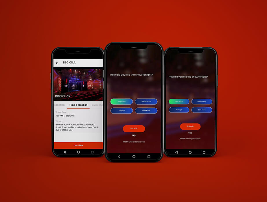
Modal windows are pop-up messages that need user interaction before they can be dismissed. They're used for important notifications, confirmations or actions that need the user's attention. For instance, a model window message can look like: "Are you sure you want to delete this item? This action cannot be undone."
6 - In-app inbox
An in-app inbox is a dedicated section within app where users can find all their messages, notifications and updates. It's useful for keeping your users up-to-date without making them too busy with pop-ups. For example, "You have 3 new messages in your inbox. Check them out now!"
Designing effective in-app messaging
Designing effective in-app messaging involves a combination of strategic planning, user-centric design and continuous optimisation. Here’s a step-by-step guide to help you create impactful in-app messages 👇
Step 1 – Define your objectives
Decide what you want to achieve with your in-app messages (eg, user engagement, feature adoption, feedback collection). Further, you can establish Key Performance Indicators (KPIs) to measure the success of your messages (eg, click-through rates, conversion rates).
Step 2 – Understand your audience
Divide your user base into segments based on demographics, behaviour or usage patterns. This will help you tailor your messages to each segment to make them more relevant and engaging.
Step 3 – Choose the right message type
You should choose the right messaging type based on your different user requirements. For example, you can choose modal windows for important announcements or requests that need user interaction. Banners could be used for quick updates or tips that don’t disrupt the user experience.
Step 4 – Craft compelling content
Keep your messages short and to the point, using simple language. You can also choose to personalise messages with a user name or other personal details to make the message more engaging. Plus, include a Call-to-Action (CTA) to clearly state what you want the user to do next.
Step 5 – Design for engagement
Make your messages align with your app’s overall brand design, which incorporates buttons, links or other interactive elements to encourage user engagement. You can also use images, icons or animations to make your messages more appealing.
Step 6 – Optimise timing and frequency
Avoid overwhelming users with too many messages. Instead, deliver messages when they are most relevant. For instance, when users are most active or when they perform specific actions.
Step 7 – Test and iterate
Experiment with different message types, content and timing to see what works best for your business. Make sure to only test one thing at a time to generate clear data. Also, check your KPIs often to see how your messages are doing. Use the information from your tests to improve your in-app messaging strategy.
Step 8 – Technical reliability
Make sure your in-app messaging platform is seamlessly integrated with your app. For this, you can conduct thorough app testing to make sure messages are delivered correctly and without technical issues.
Step 9 – Respect user preferences
Provide users with the ability to opt out of certain types of messages. Also, allow users to give feedback on your messages and use this feedback to improve your strategy.
Step 10 – Stay compliant
In-app messaging should follow relevant privacy laws and regulations regarding how user data is being used and why they are receiving certain messages.
Difference between in-app notifications and push notifications
Push-notifications and in-app messaging are different. Let’s see how.
In-app messaging | Push notification | |
Definition | Messages that appear within the app while it is open and in use | Messages that appear on the user's device screen, even when the app isn't in use |
Context | Often contextual and related to the user's current activity | Generally used for alerts and updates that are important but not necessarily related to the user's current activity |
Types and formats | Varied formats like banners, modal windows, tooltips and full-screen messages | Standard text or rich media formats |
Use cases | Onboarding, feature highlights contextual tips, feedback requests | Alerts, promotions, reminders, re-engagement |
Advantages | Contextual relevance, non-intrusive, immediate engagement | High-visibility, immediate attention, effective for re-engagement |
In-app messaging: challenges and solutions
Here’s brief about 3 most-faced challenges along with most recommended solutions. 👇
1 - User fatigue
Users can become overwhelmed and disengaged if they receive too many messages. This can lead to a poor user experience and decreased effectiveness of the messages.
Solutions to user fatigue
- Segmentation - divide your user base into segments based on preferences and usage patterns. Tailor messages to each segment to ensure relevance.
- Frequency capping - limits the number of messages a user receives within a specific time frame to prevent overload.
- Contextual relevance -make sure that messages are contextually relevant to the user's current activity within the app.
- User control - provides users with the option to customise the types and frequency of messages they receive.
- A/B testing - experiment with different message frequencies and types to find the optimal balance.
2 - User impact measurement
Understanding what works and what doesn't is crucial for optimising your messaging strategy.
Solutions for user impact measurement
- Define KPIs - establish KPIs such as click-through rates, conversion rates and user engagement metrics.
- Analytics tools - use analytics tools to track and monitor user interactions with in-app messages.
- User feedback - collect user feedback through surveys or in-app feedback forms to understand the impact of your messages.
- Behavioural analysis - analyse user behaviour before and after receiving messages to assess their impact on engagement and customer retention.
3 - Data privacy and compliance
Addressing privacy and data-related challenges with thoughtful strategies and solutions can create an effective in-app messaging system. This would enhance user engagement, improve user experience and respect user privacy.
Solutions for data regulation
- Transparency -be transparent about how user data is collected, used and stored. Inform users through clear privacy policies and consent forms.
- Opt-in/opt-out options - provide users with the ability to opt in or opt out of receiving certain types of messages.
- Data minimisation - avoid collecting personal information that is not required for delivering messages.
- Security measures - implement robust security measures to protect user data from unauthorised access and breaches.
Conclusion
With in-app messaging, you can transform your user interactions and drive meaningful business results.
These messages address issues by delivering contextual, timely and relevant information directly within the Android app or an iOS app.
But, if you haven’t built your mobile app yet, you can use our composable software platform to build your dream software. It’s easy, fast and cost-effective and you don’t need any coding skills.
Builder.ai’s custom software platform helps you build your app or software efficiently. We:
✅ - Assign you a dedicated project manager, who keeps all stakeholders on your software project aligned and on track — and you never need to speak to a software developer or write a single line of code
✅ - Speed up development time by giving you access to a comprehensive library of reusable features, fitted together by AI
✅ - Give you upfront costs and competitive timelines so your project stays under control
If that’s something you’d like to explore, please get in touch 👇
Create robust custom software today
100s of businesses trust us to help them scale.
Book a demoBy proceeding you agree to Builder.ai’s privacy policy
and terms and conditions
Harsh Priya is a writer at Builder.ai. She has over 3 years of experience in content marketing, spanning across fields like AI, Machine Learning, software, tech, health and lifestyle. With a background in English literature and a fervent passion for research and analysis, Harsh transforms complex concepts into compelling and insightful narratives that educate and drive significant reader engagement.






 Facebook
 X
X LinkedIn
 YouTube
 Instagram
 RSS
RSS


