We've been working tirelessly to enhance the Builder Now experience, and are excited to unveil a set of updates that will make navigating and crafting your app prototype a breeze. Say goodbye to complexity and hello to a redesigned UI (user interface), streamlined editing, and an innovative review mode.
So, let's dive into the new world of Builder Now and find out how they’ll help you.
1. Redesigned UI for effortless navigation
Problem:
After speaking with our customers we learned about some challenges in navigating Builder Now, leading to confusion among internal teams and lower engagement with calls to action.
Solution:
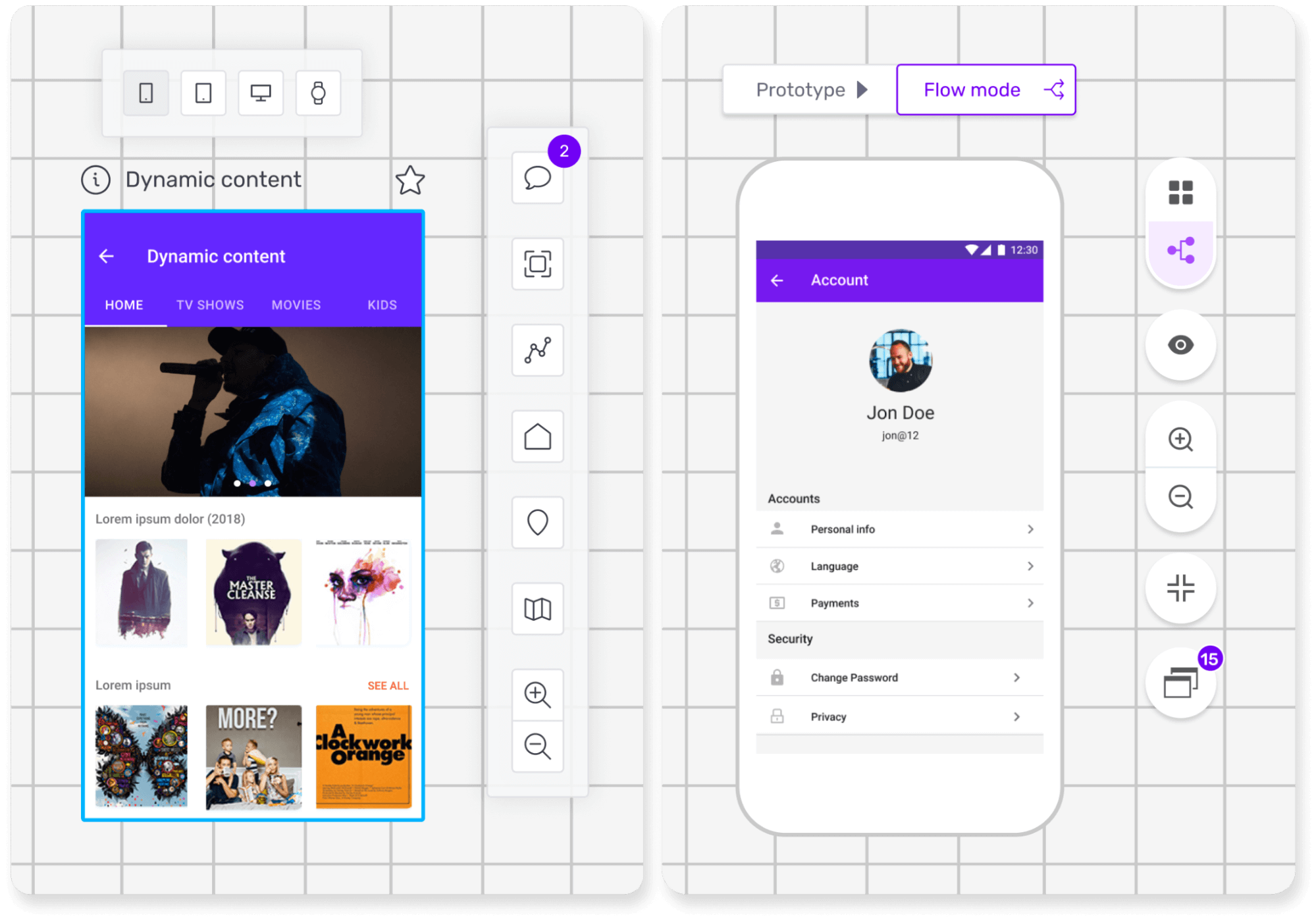
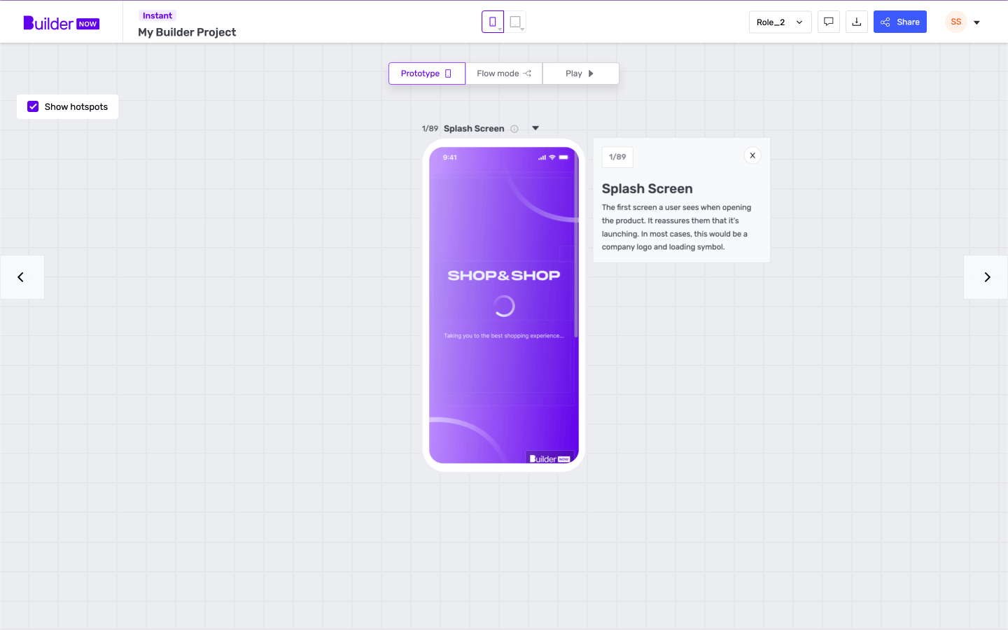
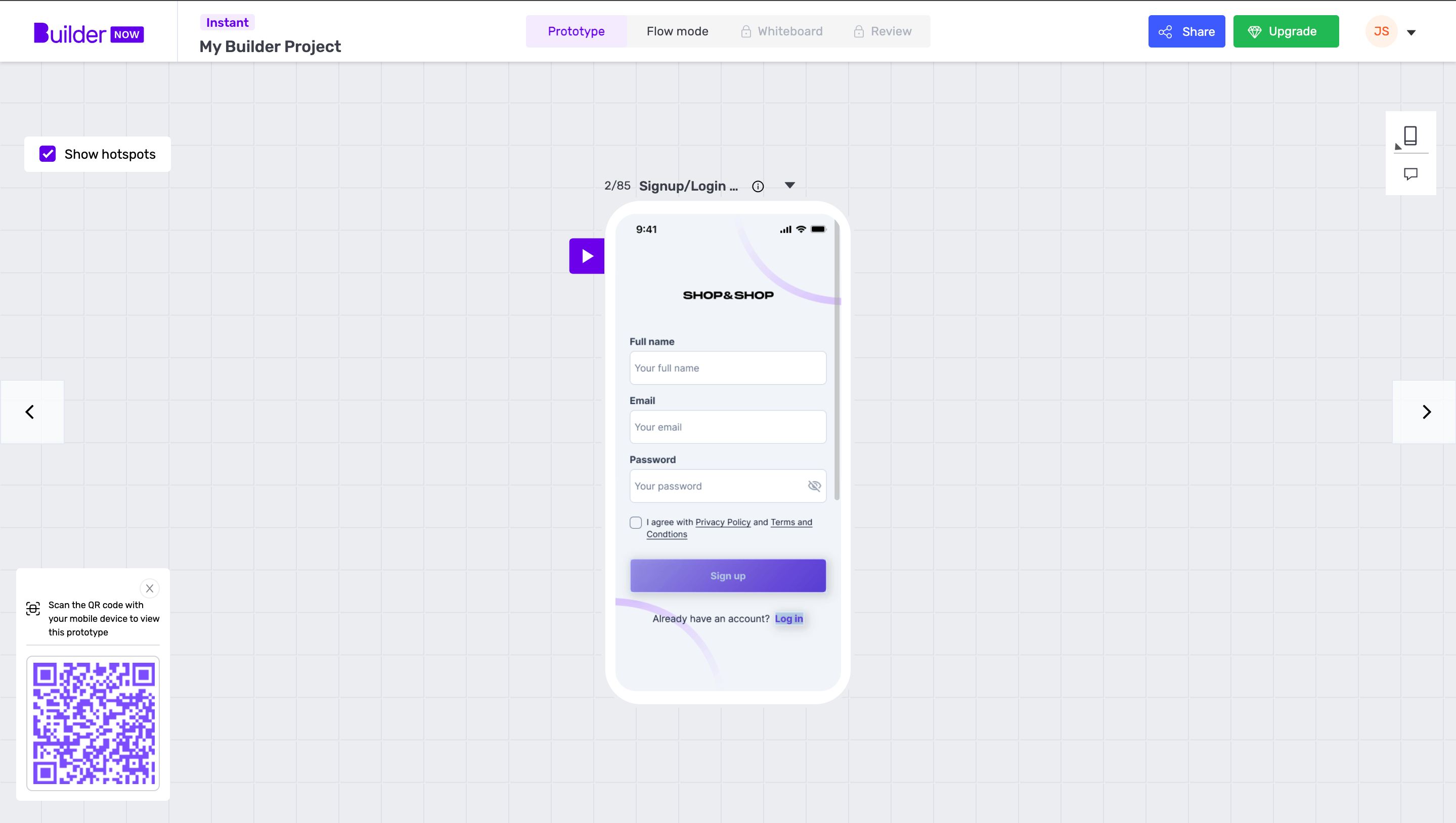
We've given Builder Now a fresh look with a redesigned UI, making navigation a piece of cake. A consistent navigation bar now houses two clear calls to action: share and upgrade. Download and share options are conveniently combined, and all feature modes are accessible through a single top navigation bar. With options locked pre-purchase and unlocked post-purchase, you'll have a seamless experience. Plus, we've moved other options, such as devices and comments, to the toolbar for added convenience.
Benefit:
We’ve seen an amazing uprise in engagement, as users like you have been able to access everything they need via the navigation bar easily. And the clearly defined actions “share” and “upgrade” have helped our customers find what they need.
2. Edit Mode: One-stop-shop editing extravaganza!
Problem:
Editing options scattered across different screens made it challenging for users to navigate and create prototypes efficiently.
Solution:
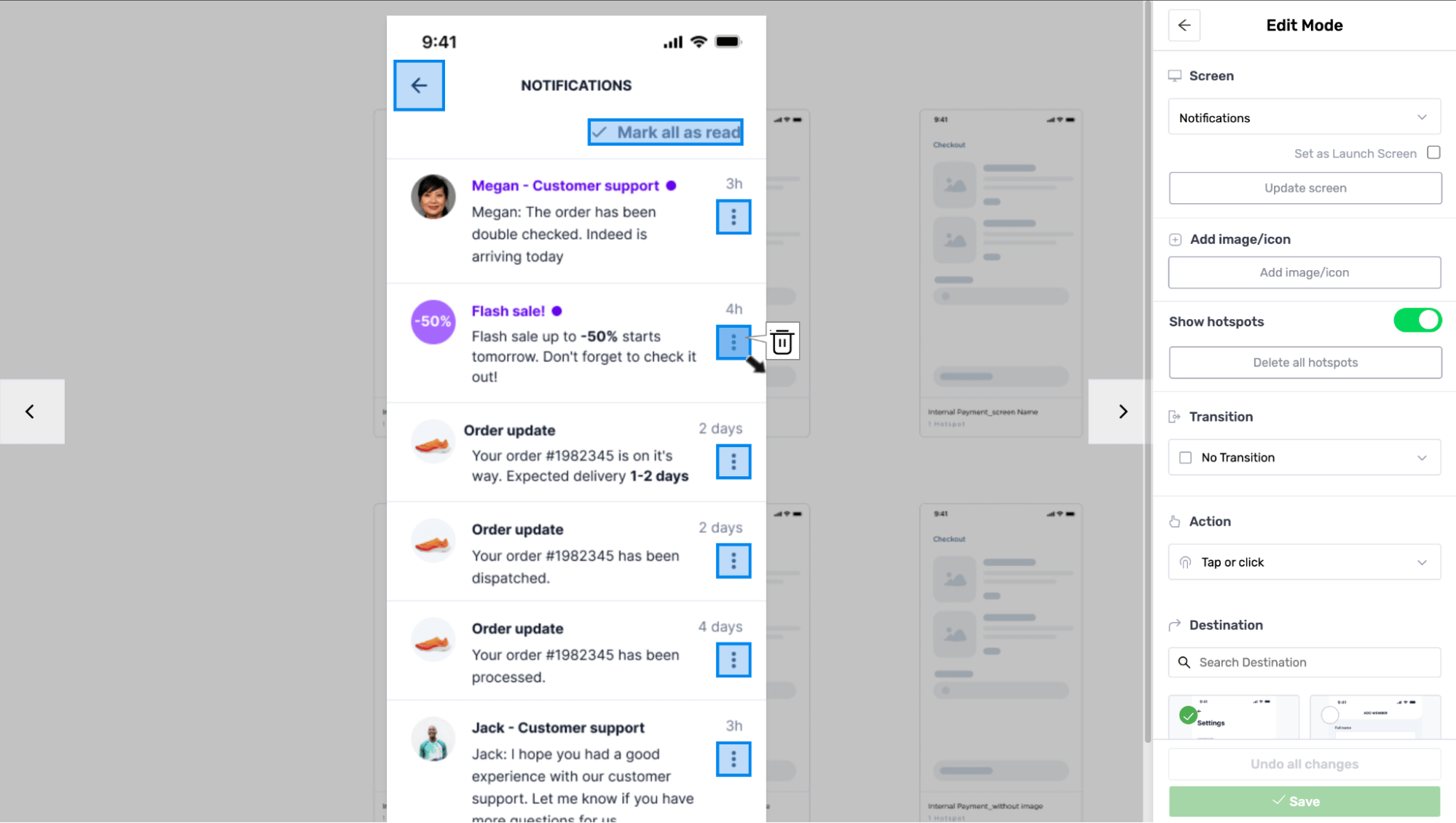
Introducing the all-new “Edit Mode”! Now, you can access all editing options in one place, eliminating the need to jump between screens. Want to start fresh? We've added a ‘delete all’ hotspots feature for bulk hotspot removal. (For those wondering what hotspots are, they’re a techy term for areas users can tap/click to navigate to their next screens). And you can now focus solely on on-screen designs with the new show/hide hotspots functionality.
Benefit:
Say goodbye to UX headaches and hello to a seamless editing experience. We’ve created a better journey flow for you and ultimately saved you some valuable time from switching between screens, to focus on what really matters to your business!
Creativity just got a whole lot easier.
3. The new review mode
Problem:
Reviewing screens lacked functionality, accessibility, and the comprehensive overview seen in other design platforms like Figma.
Solution:
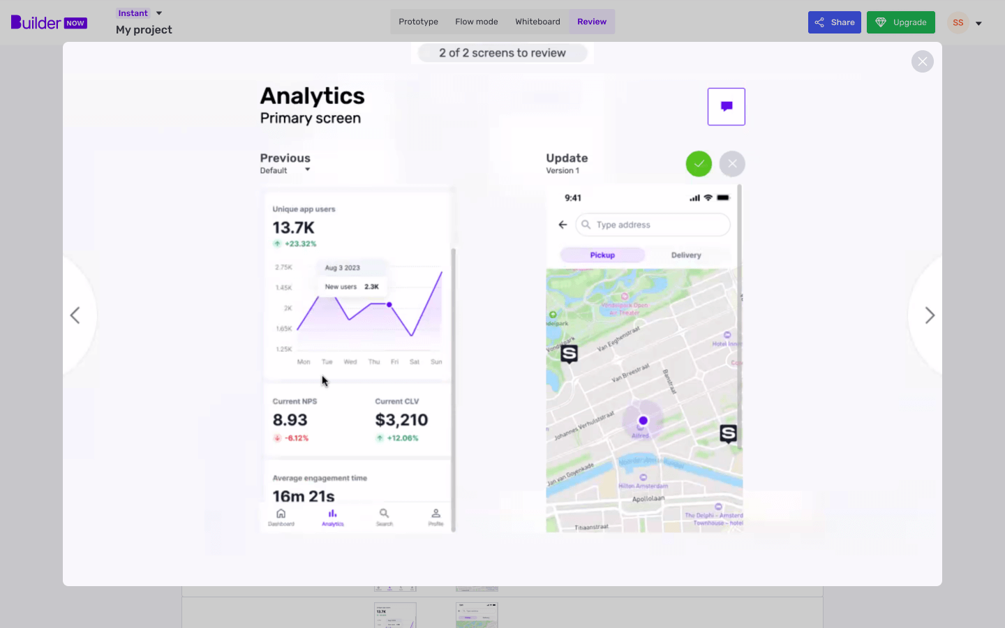
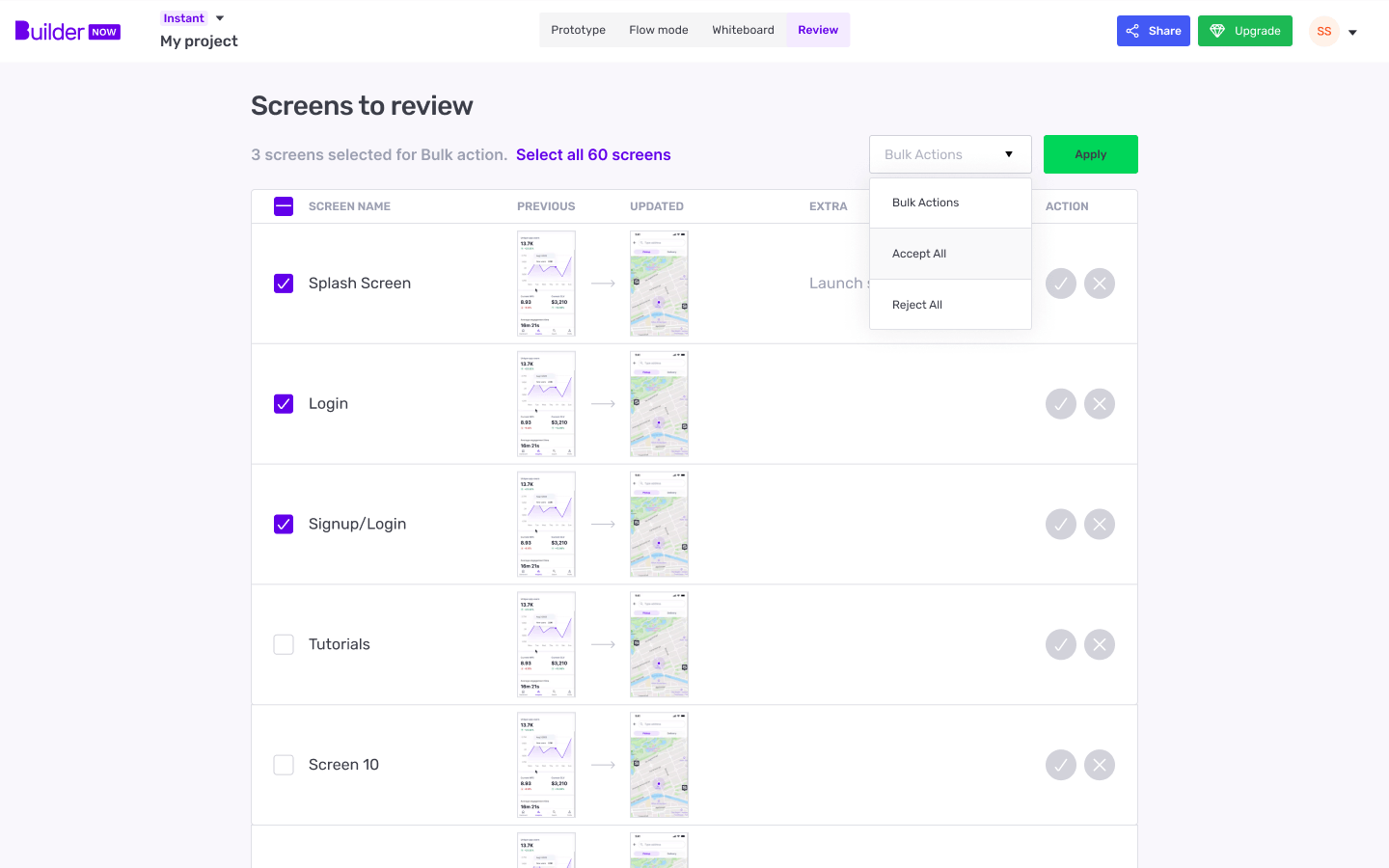
Enter the game-changing Review Mode. Now, you can review a list of features and screens submitted for review. Select and approve or reject multiple screens with ease. We've listened to your feedback, and we're giving you the power to elevate your design review experience.
Benefit:
No more limitations—just a smooth, efficient, and comprehensive design review process.
4. Improved Prototype API: A new reworked prediction model for user destinations
Problem:
Hotspots (that’s an area a user can tap/click to navigate to a screen) in pre-purchase prototypes weren’t as perfect as we’d have liked them to be, leading to overlapping, incorrect sizes and duplicate hotspots.
Solution:
We’ve upgraded our Prototype API tool with mapping features that can identify areas users would most likely click and tap to move onto a new screen. Our new mapping tool can ensure precise feature-to-feature mapping for user's clicks, also known as hotspots.
Benefit:
Enjoy accurate, refined hotspots that enhance the overall prototype experience. Your prototypes, whether pre-purchase or post-purchase, are now in a league of their own.
Our Builder Now updates are here to make your creative journey smoother and more enjoyable than ever. We're on a mission to make app building a fun and easy experience. So, embrace the new UI, revel in the efficiency of edit mode, elevate your design review process with review mode, and experience the precision of our improved Prototype API.
With the latest Builder Now updates, creativity knows no bounds. Happy building!
Constandina is the Senior Content Executive at Builder.ai. With 4+ years of experience in marketing, copywriting and with a special interest in creative writing, she squeezes an audacious personality into any complex topic. Constandina has an MSc from the University of Edinburgh.










 Facebook
 X
X LinkedIn
 YouTube
 Instagram
 RSS
RSS


