Today, many people are seeking out e-learning platforms like Coursera that make learning new skills incredibly easy.
In 2023 alone, Coursera made a total revenue of $635.8 million, growing at 21%. With users able to learn at their own pace and access a wide range of courses, the platform is a popular choice for people looking to upskill and improve their career trajectory.
As with any platform, though, there are some downsides. For example, some users feel that certain courses are too broad and lack the depth needed in their specific fields. Others think that the platform doesn't offer enough practical, hands-on learning experiences and focuses solely on theoretical knowledge.
Moreover, while some of the basic courses are free, the prices for certification courses can be steep. The platform also doesn’t offer job placement services or personalised career advice.
Whether you're a new business or an SMB that wants to create the next big thing, developing an e-learning platform that solves these problems could be highly rewarding.
In this guide, we’ll look at the must-have features for your e-learning app and then explain how you can build your own using our platform.
What is an e-learning app?
An e-learning app is a digital platform designed to streamline the delivery of educational content over the internet. It helps users learn and improve their skills by giving them access to learning materials, like courses, videos and interactive activities, anytime, anywhere.
They often feature multimedia elements like videos, quizzes and forums to enhance the learning experience. E-learning apps are popular with students, professionals and lifelong learners because they offer flexibility, personalised learning paths and the convenience of learning at your own speed. Plus, you can do all of this without visiting a classroom.
Types of e-learning apps
There are a wide range of e-learning apps you can build. Some of the common ones are 👇
E-learning marketplace apps
E-learning marketplace apps let teachers sell their courses and students buy learning materials. Users can browse courses from different educators to improve their skills in various fields.
These apps often include features like course catalogues, user reviews and progress tracking.
Examples of such platforms include Udemy and Teachable.
Language learning apps
Language learning apps help people learn new languages at their own pace. These platforms offer courses in multiple languages, featuring interactive lessons and speech recognition for pronunciation practice.
They're designed to be user-friendly, supporting learners from beginners to advanced levels.
Duolingo is a well-known example of this type of app.
Certification platform apps
Certification platform apps are designed to partner with universities and educational institutions to offer online courses and certifications. These platforms help learners earn formal qualifications from recognised institutions, enhancing their career prospects.
Features typically include structured course modules, assessment tools and certificates upon completion.
Coursera and Unacademy are prominent examples of a certification platform.
Live classes apps
Live classes apps are tailored to educators and institutions offering real-time, interactive online classes.
Unlike platforms that provide pre-recorded sessions, these apps focus on live instruction, making it possible for students to engage directly with teachers and classmates.
This setup recreates the dynamic of a traditional classroom in a virtual environment.
Platforms like Zoom and Google Classroom have become essential for many educational institutions offering live classes.
Must-have features of an e-learning app
To succeed in the education industry — which is already packed with thousands of applications — you need to offer something unique to the market. Choosing the right app features can help you do this..
Single sign-on (SSO)
One-tap sign-up options using existing social media accounts like Gmail, Facebook or LinkedIn make it convenient for users to access your app, increasing the likelihood of registration and continued use.
Search and filter
An easy-to-use search bar is crucial for an e-learning app, allowing users to quickly find specific courses or content by entering relevant search terms.
Additionally, robust filtering options allow learners to narrow down search results based on criteria such as course categories, ratings, price or course provider.
Course categories
This feature helps learners browse through different segments of educational content, improving app user engagement and content visibility.
Gamification
Integrating gamification elements such as badges, leaderboards and rewards makes learning more engaging and fun. This feature motivates learners by adding a competitive element and can accelerate the learning process.
Reviews and ratings
Incorporating a system for reviews and ratings allows users to provide feedback on courses, which can help educators improve their offerings. It also helps potential users to make informed decisions based on the experiences of others.
Seamless checkout
Including multiple payment options ensures that users can easily purchase courses without hassle, enhancing the overall user experience and facilitating revenue generation.
Offline access
Allowing learners to download course materials ensures that education is accessible to those with limited or unreliable internet access.
In-app notifications
In-app notifications are key engagement drivers for any app because they give your users detailed information about other people’s activities, including what they’re liking and sharing and how they feel about your posts.
User dashboard
A personalised dashboard for users to track their progress, upcoming courses and achievements is essential. This feature helps learners stay organised and motivated by clearly displaying their learning journey and milestones.
Who should you choose to build your e-learning app?
There are many ways you can create an e-learning app. If you’re a programmer, you could create one yourself. Just remember, this might take a while. Coursera has hundreds of courses, each with hundreds of thousands of lines of code.
Alternatively, you can hire a team of mobile app developers, as they can build robust e-learning apps with a range of custom features. However, the challenge here is to accurately calculate the total cost of app development.
They often charge on an hourly or daily basis and once you factor in the costs of app development, design, app testing and listing, the expenses quickly spiral out of control.
No-code app builders are a simpler, more budget-friendly solution. You don’t need coding skills to use them and you can build apps quickly by dragging and dropping pre-made components.
However, no-code platforms may lack the flexibility to add complex features or unique customisations, and scaling the app as your user base grows can be problematic due to performance limitations.
This is where Builder.ai comes in. 👇
Want to start your app project with us?
Book a demoSpeak with one of our product experts today.
By proceeding you agree to Builder.ai’s privacy policy and terms and conditions

Why Builder.ai is different
Builder.ai offers the best of both worlds by providing a solution that bridges these gaps. It provides the customisation and scalability of professional developers along with the efficiency and cost-effectiveness of no-code builders, making it an ideal choice for developing your e-learning app.
Around 80% of all software is made up of around 650+ features. We package each basic feature as a reusable Lego-like block. Explain your idea to our AI companion, Natasha, and she uses these blocks to rapidly create an outline of your app.
The work is completed faster and cheaper because Natasha handles all the repetitive coding. Then it’s off to our app design team and mobile app developers. They personalise it and create any bespoke elements you need.
To build your e-learning app, simply head over to Builder Studio. The Builder Studio platform has been built with user convenience in mind and intuitively guides you through the app creation process.
Let’s dive in to the step-by-step process 👇
1 - Discuss your ideas with Natasha
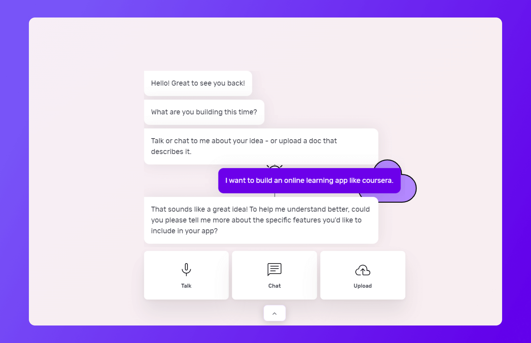
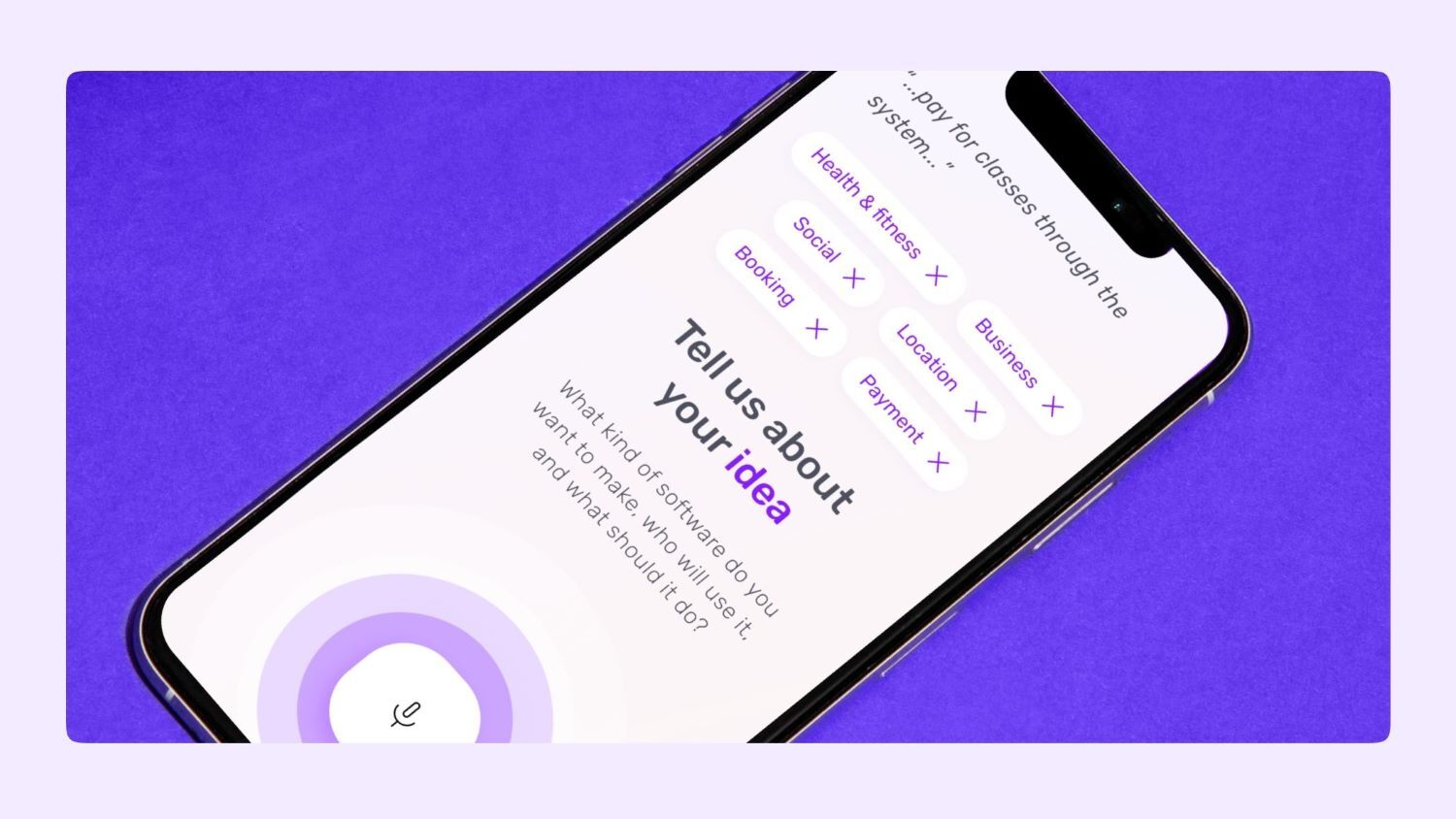
On Builder Studio, you’re greeted by Natasha. You can express your e-learning app idea to Natasha via voice, text or uploading a PDF or doc file.
Before you chat with her, have a checklist of app features and be as descriptive as possible about your app idea. The more detailed information you give to Natasha, the better her suggestions will be.
For instance, a prompt could look like this:
“I want to create an e-learning app like Coursera where users can search and enroll in diverse online courses.
“Users should be able to log in, view detailed course descriptions, educator profiles and user reviews for each course offering.
“The app should also allow users to track their progress, receive assignment reminders and access grades and feedback.
“Additionally, the app should support interactive features like quizzes and discussion forums, provide certificates upon course completion and include secure payment processing for course enrollment.”
Based on your prompt, Natasha will ask you some supporting questions and you simply need to answer them based on your requirements.
2 - Choose a base
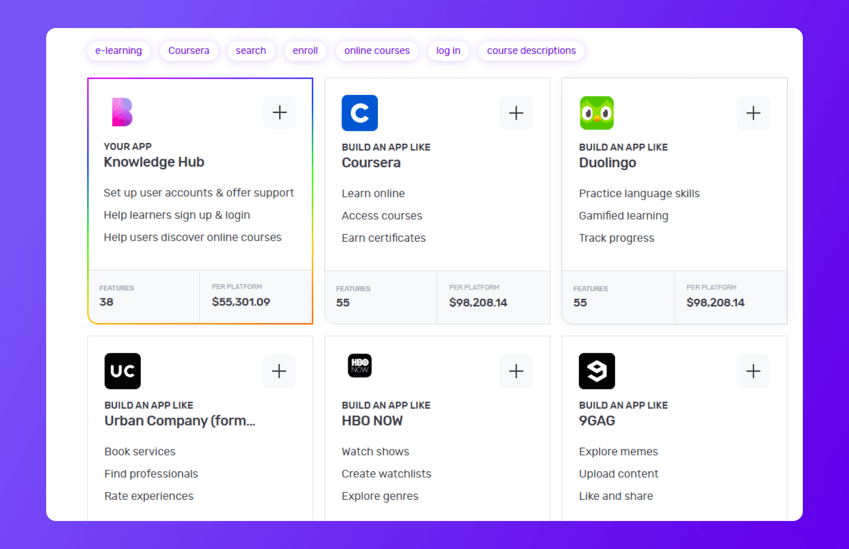
Once you’ve provided your requirements to Natasha, she’ll create a custom framework for your app based on everything you tell her. She'll also suggest some pre-built bases she thinks are best suited for your app.
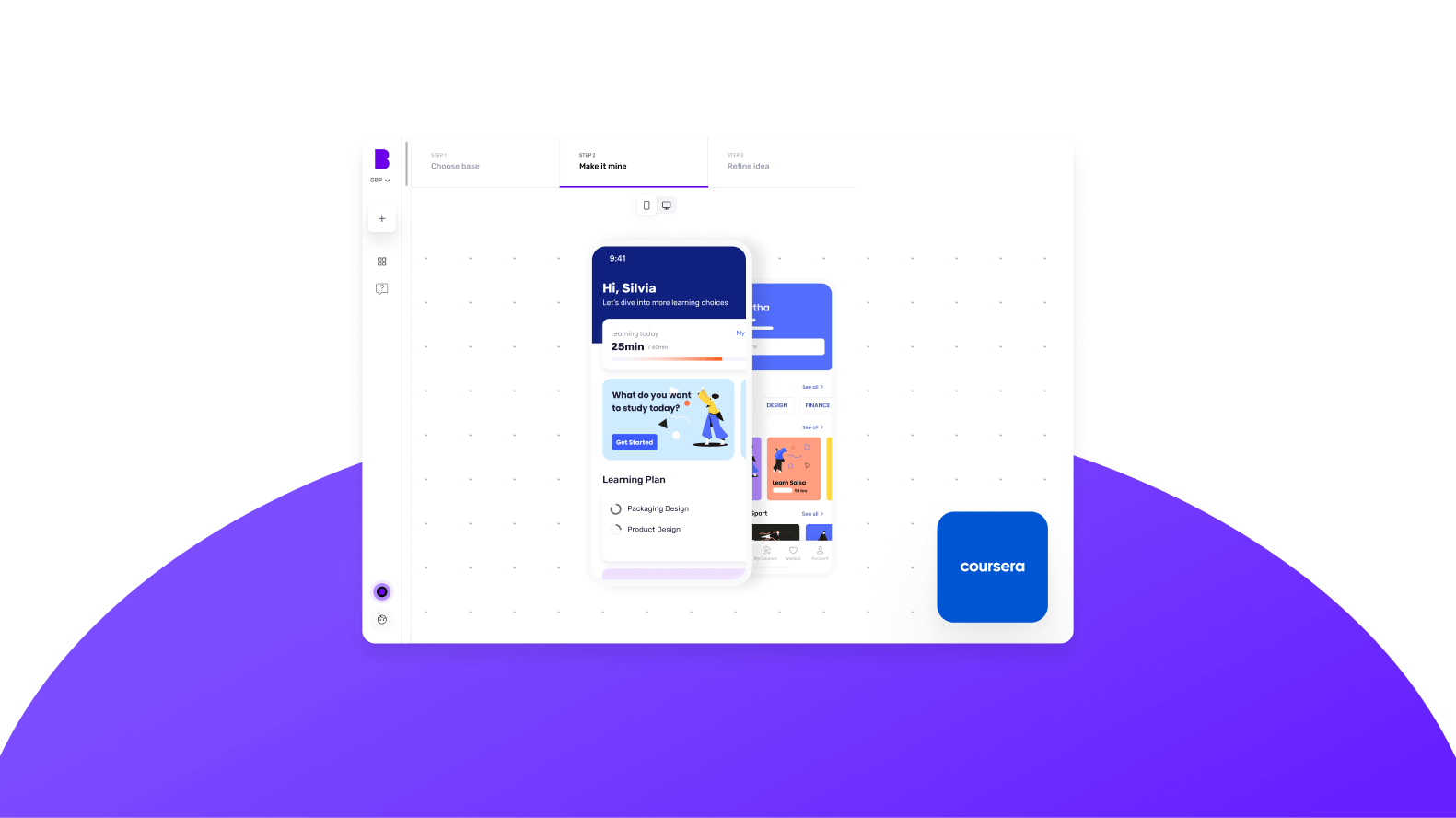
For instance, once you tell her to create an app like Coursera, she’ll suggest a custom base similar to Coursera and share any matching core bases as well.
You can choose up to 3 you feel are related to your big idea by simply clicking the ‘+’ icon. These selections make it easier for us to understand the features your app needs. When you’re ready, click 'Next'.
3 - Make it mine
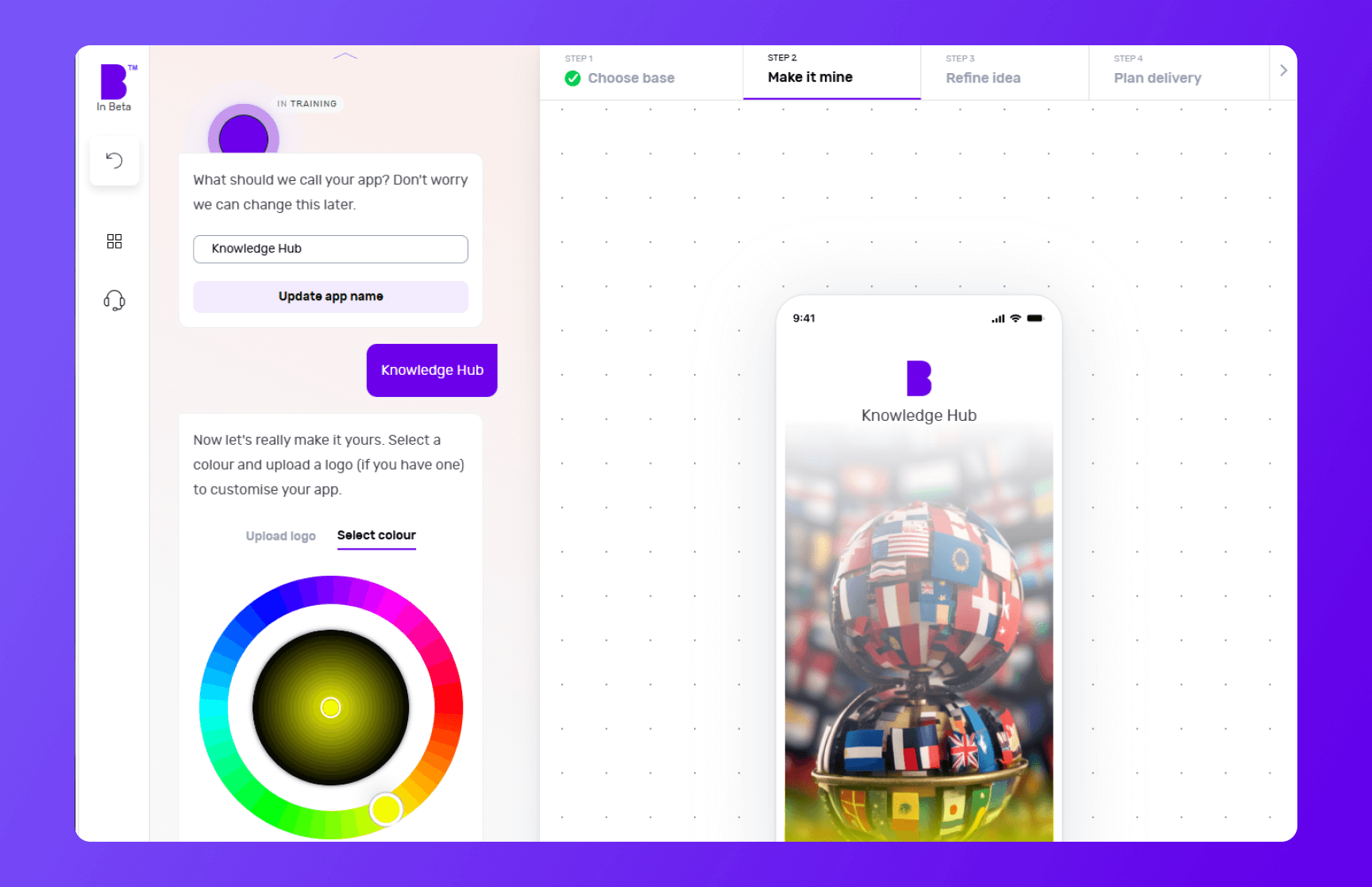
The 'Make it mine' step aligns your app with the identity of your brand. In this step, you provide your app’s name, choose the colour scheme using the colour wheel and upload the logo of your brand.
If you already have a website, you can add the link and Builder Studio will automatically pick your brand’s colours and logo.
Once you’ve personalised your app’s name, colour and logo, you can click ‘Next’.
4 - Refine your app idea
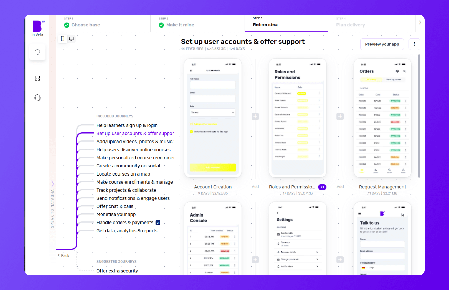
Now comes the fun bit.
In the 'Refine idea' stage, you can review and customise your app journeys and features and also create an instant prototype of your app.
Journeys
In only a matter of seconds, Natasha creates app user journeys with corresponding features.
Go through these journeys carefully and see if your app needs additional journeys. For instance, check if you want to add journeys for monetization, sending notifications or any other relevant journey.
To add journeys, click on 'See more suggestions'. Doing so will open the list of pre-built journeys. You can browse the list and select the journeys you’re missing. You can also add custom journeys by clicking on 'Add custom journey'.
Features
By clicking on individual journeys, you can see the feature list each journey contains. Doing so will open the features list each journey contains. You can scroll through the features list and check if a journey contains non-essential features or if you want to add extra features.
To remove a non-essential feature, you can hover over the feature and click ‘Remove’. This way you can manage project costs. If you’re not sure what features to remove, you can click on an individual feature and check the label at the top. We highly recommend keeping the ‘Essential Features’.
In case you want to add more features, you can simply click the ‘+’ button. Clicking the ‘+’ button will take you to the list of pre-built features. Here you can go through different categories or use the search bar to look for missing functionality. In case you don’t find the feature you’re looking for, you can also add a custom feature by clicking on 'Add custom feature'.
Instant prototype and user flow
Once you’re happy with the journeys and features of your app, you can create a prototype by clicking on 'Preview your app' in the top-right corner.
Sign up and Natasha will create a working prototype of your app. You can click on the screen at different areas to progress through the journey.
You can also see theuser flow by clicking on the 'Flow mode' at the top of the screen to see how users will interact and navigate within your app.
If you need extra help, Natasha is on hand to help and you can interact with her at any time by clicking on 'Speak to Natasha'.
She’ll provide you with suggestions and help you find features or journeys from the library. Or you can click on 'Book a demo' to talk to our product managers who’ll guide you through your app development journey.
Click on 'Save & Continue' to go to next step and also to save your progress to make sure it doesn’t get lost.
5 - Plan delivery
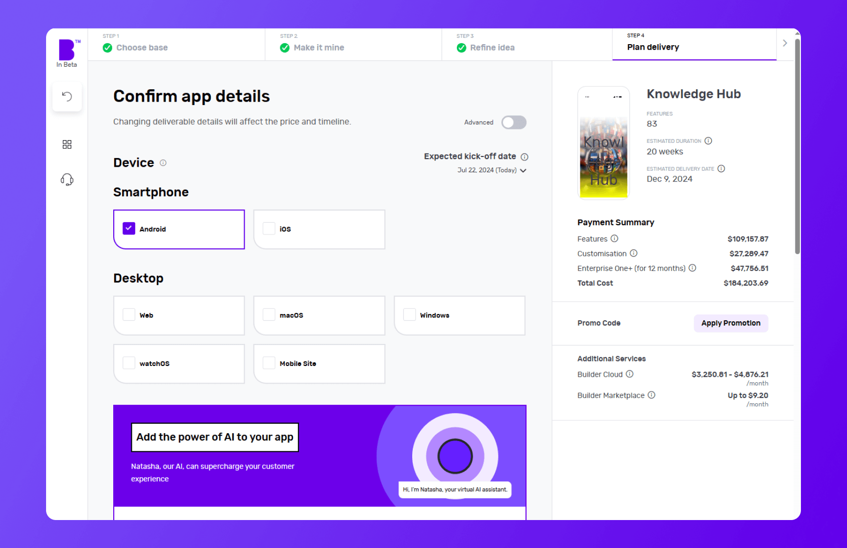
It’s time to choose the platforms you want your e-learning app to be available on. Want an e-learning iOS app? Click iOS. Fancy an e-learning Android app? Hit Android. Not sure whether Android or iOS is better? Choose both to develop simultaneously and see how it changes the price and timelines.
Next, you can choose to add Natasha to your platform to supercharge the customer experience of your e-learning app. Natasha uses Large Language Models (LLMs) to engage your customers in fluid, human-like conversations.
Need more control? In the development speed, you can change the speed of each phase. Need it super fast? Pay extra and we’ll make it happen. No rush? Great, you can make big savings with relaxed timelines.
Next up is Design. If you have your app designs ready, you can save your costs by clicking 'You have design' and we’ll reduce your costs accordingly. You can share your design files (preferably in Figma) and our designers will upload them, so you can kick off straight away.
If not, you can choose the 'We do your designs'. Here, you simply need to add your brand assets and we'll do everything from storyboarding to fully designed screens.
Now it’s time to plan the phases of your project. Here you get three options:
- Clickable prototype: you’ll get a visual representation of your app to test with users
- Basic build: you’ll get an MVP (Minimum viable product) – a hard-coded but simplified version of your idea; this allows you to collect feedback and iterate before you do a full build
- Full Build: you’ll get market-ready software, including a kick-off with our product team and review sessions
After that, you need to select your support plans. With 'Full Build' you get one year of Studio One support included free of charge.
Once you’ve planned your delivery, click on 'View Buildcard'.
6 - Review Buildcard
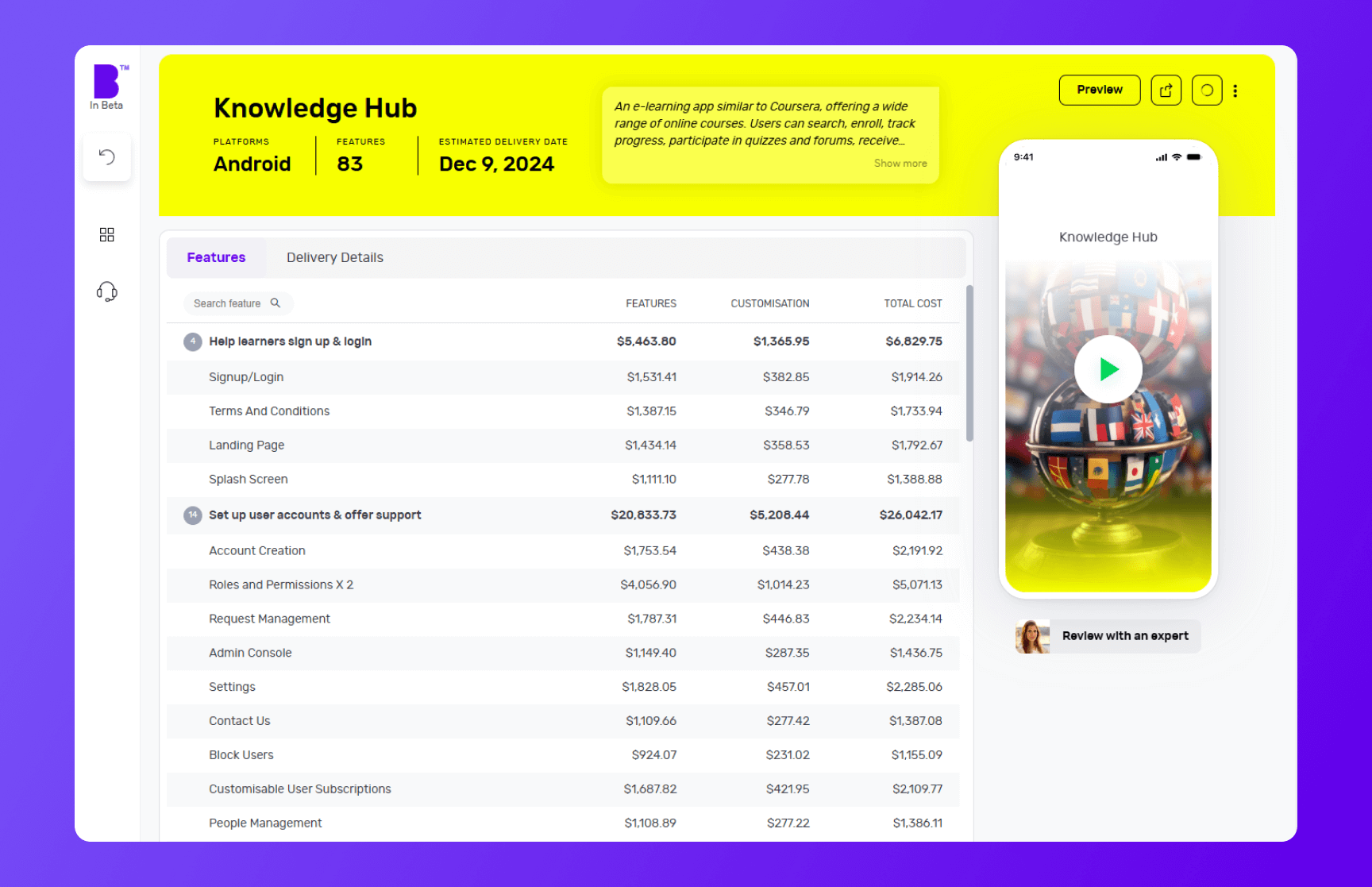
Buildcard provides you with a bird's eye view of all the selections you made in the previous steps. Here, you can review all the features, cost per feature and delivery details.
You can also download the PDF of Buildcard or invite others to show your team members what you’re building.
If you want to make any changes, simply click on 'Edit Buildcard' under three dots in the top-right corner
If you’re happy with everything, click on 'Add billing details' to go to the next section. Alternatively, if you want to review it with experts, click on 'Review with an expert'
7 - Select your payment plan
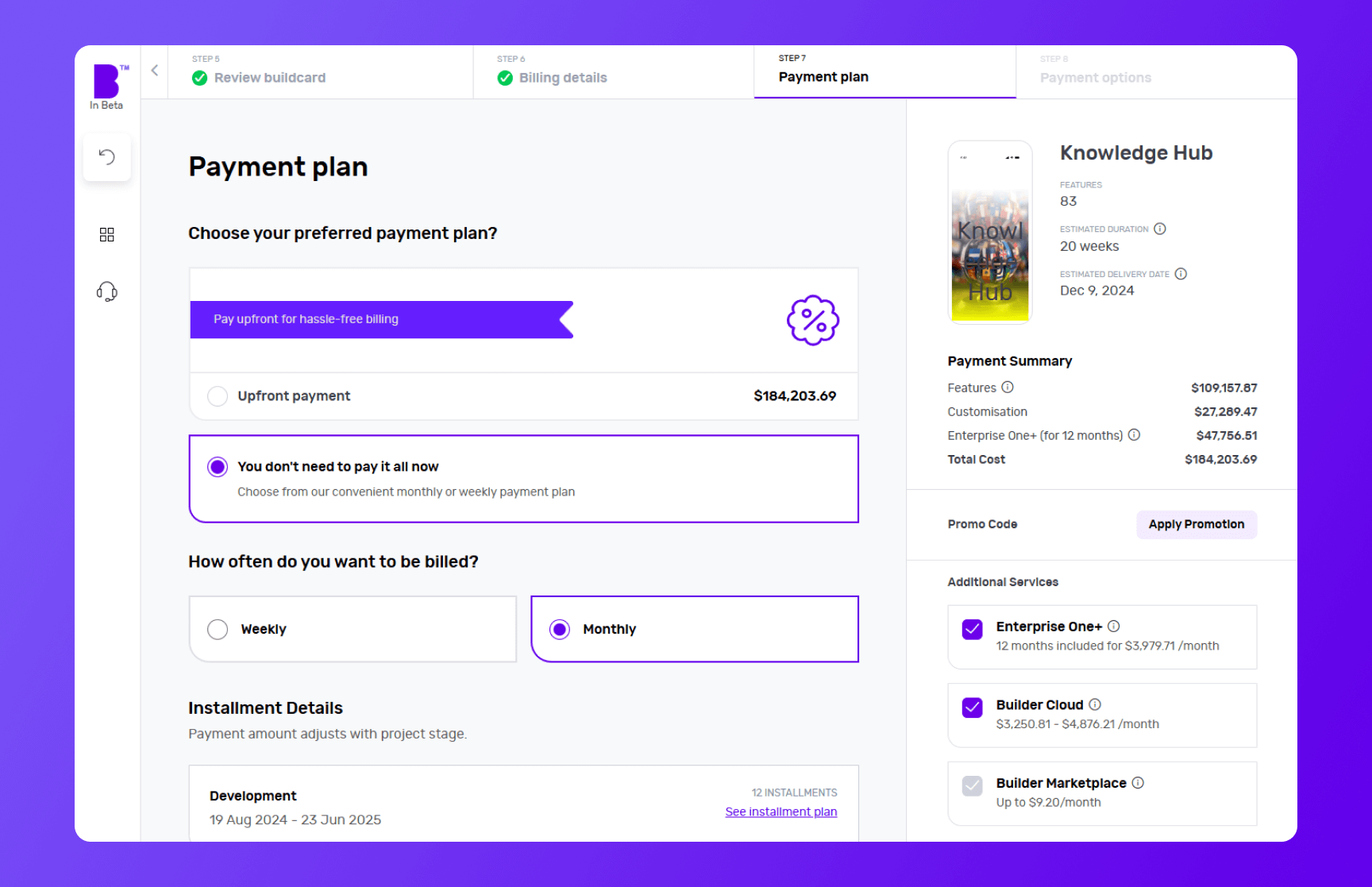
We offer weekly or monthly payment instalments, with visible payment dates and amounts for each option. You can also choose to pay upfront to reduce the cost of your build.
Simply select your preferred billing cycle, then click 'Continue' to proceed.
You’ll be asked to input your payment details and agree to the terms and conditions. Once that’s done, click 'Continue to Payment'.
When your payment is processed, you can set up a meeting with our product managers to begin your app development project.
8 - Monitor your app build in real-time
With Builder Home, your real-time project dashboard, you can monitor development progress and make sure your app is exactly the way you want it.
This includes access to a suite of collaboration tools to help improve your app design. You can chat with your team of experts in Builder Meet, brainstorm in Builder Whiteboard and visualise your ideas with free Tailor-made prototypes from Builder Now.
Conclusion
While e-learning apps like Coursera have changed how we acquire new skills, they also have their own set of challenges.
Creating your e-learning app isn't just about entering a competitive market; it's about creating a space that better serves the evolving needs and preferences of users.
With the right features and a user-centric approach, your e-learning app can provide a refreshing alternative to the industry giants.
This is where Builder.ai comes into play. We simplify the app development process and make it accessible to even those with limited technical knowledge.
If that sounds good, hit the banner below and kick off your e-learning app project with us today 👇
Want to start your app project with us?
Book a demoSpeak with one of our product experts today.
By proceeding you agree to Builder.ai’s privacy policy and terms and conditions

Gaurav is the SEO Content Writer at Builder.ai. Being an Engineer and Marketing MBA, he has a knack for converting technical jargon into marketing content. He has 8+ years of experience creating content and designing marketing campaigns that drive organic growth for B2B companies and tech startups.






 Facebook
 X
X LinkedIn
 YouTube
 Instagram
 RSS
RSS
